

Zune's Design Language and How It Evolved into Windows Phone
And after Windows Phone, all of Microsoft for a period of time, until Fluent Design became Microsoft's software-wide staple.


Zune was a line of digital media products and services developed by Microsoft that included portable media players, software, a music streaming service and an online store. Zune was launched in 2006 as a competitor to Apple’s iPod and iTunes ecosystem. However, Zune never gained much popularity and was discontinued in 2012.
One of the most distinctive features of Zune was its design language, which was later adopted by Windows Phone and other Microsoft products. The design language was originally called Metro but was later renamed to Modern UI or Microsoft Design Language. In this blog post, we will explore how Zune’s design language evolved into Windows Phone and what were its main characteristics.
What is a design language?
A design language is a set of guidelines and principles that define the visual appearance and interaction of a product or service. A design language helps create a consistent and coherent user experience across different platforms and devices. A design language also reflects the identity and values of a brand or company.
Some examples of well-known design languages are Apple’s Human Interface Guidelines (HIG), Google’s Material Design, IBM’s Carbon Design System and Microsoft’s Fluent Design System.
What was Zune’s design language?
Zune’s design language was inspired by Swiss graphic design, Bauhaus art movement, public transportation signage systems and international typographic style. It aimed to create a simple, elegant and functional user interface that focused on content rather than chrome (the graphical elements that surround the content).
Some of the key elements of Zune’s design language were:
Typography: Zune used large, bold and sans-serif fonts (mainly Segoe) to display text in a clear and legible way. Text was often used as a primary navigation element, with words being cut off at the edge of the screen to create a sense of movement and dynamism.
Color: Zune used a limited color palette that consisted mainly of black, white and accent colors (such as magenta, orange or green). The accent colors were used sparingly to highlight important information or actions. The background color changed according to the album art or theme selected by the user.
Grid: Zune used a grid system to align text and images in a consistent way across different screens. The grid also helped create a hierarchy and contrast between different elements.
Animation: Zune used subtle animations to enhance the user experience. For example, when scrolling through lists or menus, the text would fade in or out smoothly. When playing music or videos, the album art would rotate slowly in 3D space.
Minimalism: Zune avoided unnecessary visual clutter such as buttons, icons or gradients. Instead, it relied on gestures (such as swiping or tapping) to perform actions. The interface also left ample white space around text and images to create a sense of openness.
How did Zune’s design language evolve into Windows Phone?
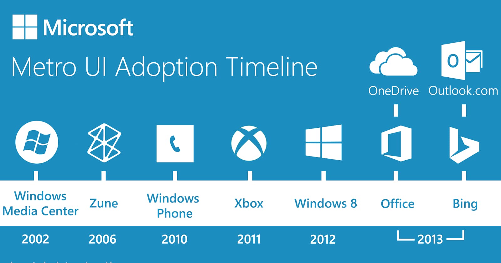
Zune’s design language evolved in Windows Media Center (a software application for media playback) and was formally introduced as Metro during the unveiling of Windows Phone 7 (a mobile operating system) in 2010. Metro was designed to be “authentically digital”, meaning that it embraced rather than imitated physical objects such as paper or glass.
Metro also aimed to create an integrated user experience across different Microsoft products such as Xbox 360 (a video game console), Outlook.com (an email service), Windows 8 (a desktop operating system), Bing (a web search engine), Skype (a video calling service), OneNote (a note-taking app), etc.
Some of the changes that Metro brought from Zune were:
Live tiles: Live tiles were square or rectangular icons that displayed dynamic information such as weather updates, news headlines, social media notifications, etc. Live tiles could be pinned to the Start screen (the main screen on Windows Phone devices) for quick access.
Hubs: Hubs were sections that grouped related content such as photos, music, contacts, games, etc. Hubs could be accessed by swiping horizontally on the Start screen. Hubs also integrated content from different sources such as online services, local storage, social networks, etc.
Panoramas: Panoramas were screens that extended beyond the width of the device. Panoramas allowed users to explore more content by swiping horizontally. Panoramas were often used for hubs or apps with large amounts of data.
Pivots: Pivots were screens that divided content into categories such as albums, artists, and genres.
In addition to these changes, Metro also refined and expanded on Zune’s design language. For example, the typography became more polished and refined, with a focus on clarity and legibility even on smaller screens. The color palette was expanded to include more accent colors, and the use of animations became more subtle and refined.
Metro also introduced a strong focus on content and typography, with text becoming the primary navigation element. The interface was designed to feel fast and responsive, with seamless transitions between screens and an emphasis on touch-based interaction.
Over time, the design language evolved even further and was renamed to Modern UI and later to Microsoft Design Language. The principles of simplicity, elegance, and function remained at the core of the design language, with a continued focus on content and typography. Modern UI and Microsoft Design Language have been used across a range of Microsoft products, including Windows 10, Office, and Surface devices.
In conclusion, Zune’s design language was a key factor in the evolution of Windows Phone and other Microsoft products. By embracing a minimalist and functional design language that focused on content and typography, Zune set the stage for a new era of digital design that has continued to evolve and influence the technology industry to this day.